
Beyond Tellerrand: The Icon Design Process
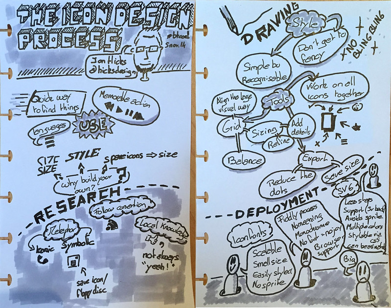
There is a few steps to follow to design an icon. John Hicks presented his workflow and the things you better have to be aware of when designing.
Here is my sketchnote:
You can grab the slides on Jon Hicks’s website.
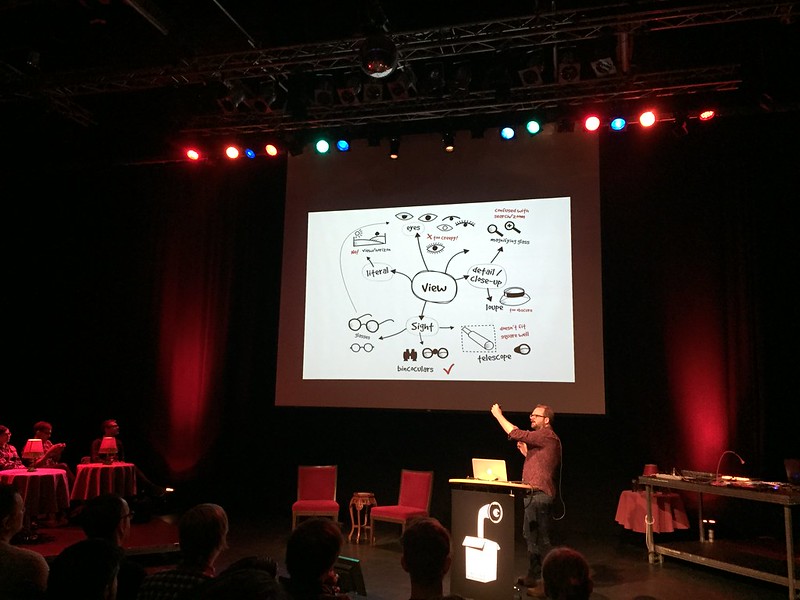
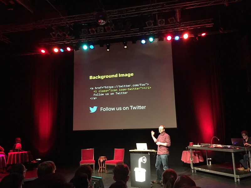
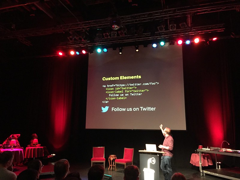
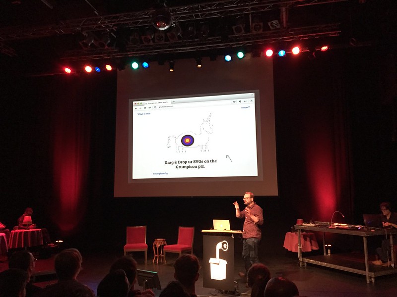
And some pictures of the talk:
Jon Hicks – The Icon Design Process – beyond tellerrand Berlin 2014 from beyond tellerrand on Vimeo.
Tweets
Some tweets related to the talk:
Didn't know @hicksdesign did Skype emoticons. Have to find him after the talk to thank him for the joy those brought to my daughter. #btconf
— Bastian Albers (@bastianalbers) 5 Novembre 2014So, @bitcrowd toilet signs are still best /cc @Hicksdesign http://t.co/S2GMAo4Ybn #btconf
— Bastian Albers (@bastianalbers) 5 Novembre 2014everybody interested in the icon/style problems @Hicksdesign is talking about, go read @scottmccloud s 'understanding comics' #btconf
— a Tom (@webrocker) 5 Novembre 2014In the West, an owl icon means wisdom. In the East: stupidity. —@Hicksdesign
In Germany: nature protection http://t.co/axl1YuiU6x
#btconf
— Gunnar Bittersmann (@g16n) 5 Novembre 2014What a great talk and speaker to start into the second #btconf day: @Hicksdesign on icon design pic.twitter.com/oJziBMd6FG
— Dennis Frank (@freshmango) 5 Novembre 2014If you like Grunticon but prefer sprites, you should give http://t.co/3BKLvrWbpo / https://t.co/6XNEPE1zJz a try +@Hicksdesign #btconf
— Joschi Kuphal 吉 (@jkphl) 5 Novembre 2014a bag is not a bag is not a bag
@Hicksdesign tremendoud talk at #btconf pic.twitter.com/07XDQlKYCs
— såndra wendebørn (@pippidot) 5 Novembre 2014If you would like my slides from the Icon Design Process talk at #btconf last week, they’re now online: http://t.co/FzAMjhMQJF
— Jon Hicks (@Hicksdesign) 13 Novembre 2014